Matrix Reports
Matrix reports allow you to group records both by row and by column. These reports are the most time-consuming to set up, but they also provide the most detailed view of our data. Like summary reports, matrix reports can have graphs and be used in dashboards.
So why would you want to use a matrix report? If you’re looking for an at-a-glance overview of data, especially for something like totals of revenue or quantity of products sold, then the matrix report format is for you.
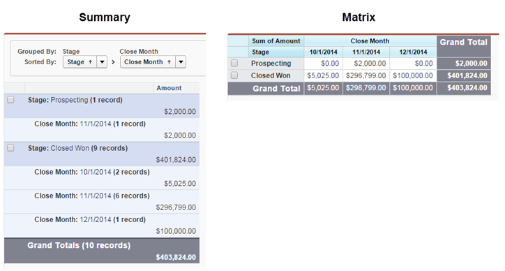
To illustrate the point, let’s look at two reports, side by side. The use case here is opportunities for last fiscal quarter, grouped by close month, with the amount summarized. Which report gives you an easier at-a-glance view of the same data?

Now that you’re convinced, let’s build a matrix report. In this example, our CEO wants to know revenue trends, month over month.
Let’s start by creating the basic report. In this step, we’ll create a matrix report showing sales by type for each month.
- On the Reports tab, click New Report, choose the Opportunities report type, and click Create.
- Apply the following filters:
- Select All Opportunities for Show.
- Select Closed Won for Opportunity Status.
- Select Close Date for Date Field.
- Select Current FY for Range. Choose the range that best fits the data you want to analyze.
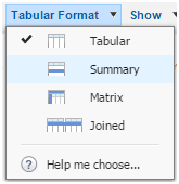
- Click Tabular Format and change the report format to Matrix.

- Group the report by Type by dragging that field into the column grouping drop zone.
- Group the report by Close Month by dragging that field into the row grouping drop zone.
- Click the menu for the Amount column and select Summarize this Field.
- Select Sum and click Apply.
- Click Show and deselect Record Count, Details and Drop Zones to clean up the view.
- Click Save. The report preview should look something like this:
