Reports and Dashboards
Your business has questions. Your Salesforce data has the answers. When you get asked to build a report, the request typically comes in the form of a question. The question might be something like:
- Which products are my top sellers?
- Who are my highest value prospects?
- Which marketing campaigns have been the most successful?
- How satisfied are my customers?
Before building a report, the trick is to take that question, ask follow-up questions, write requirements, and then map those requirements to report criteria. For example:
| Type of Information | Examples |
|---|---|
| Original Question | Which products are my top sellers? |
| Follow-up Questions |
|
| Requirements |
|
| Criteria |
|
Now at this moment, you might be looking at that Criteria column and thinking, what does all of that mean? Rest assured, we’ll cover those topics in detail as you work toward earning your badge for this module.
The point is, most people at your company will come to you with questions just like these. Here are some typical examples.
- An Account Executive planning the day’s calls, who wants to identify which prospects to contact first.
- A Support Manager analyzing deflection rate month-over-month since rolling out that self-service community last summer.
- The CEO, busily crafting the company’s annual plan, and making decisions about where to take the company next.
For each of these scenarios, a report or dashboard can provide the insight each team member needs to take action and go big, whether it’s that day, month, or year. You can be the person who translates their question into the report or dashboard they need.
Read on to learn how to get started with reports and dashboards for your company.
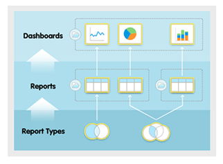
What is a report?
A report is a list of records that meet the criteria you define. It’s displayed in Salesforce in rows and columns, and can be filtered, grouped, or displayed in a graphical chart.
Every report is stored in a folder. Folders can be public, hidden, or shared, and can be set to read-only or read/write. You control who has access to the contents of the folder based on roles, permissions, public groups, and license types. You can make a folder available to your entire organization, or make it private so that only the owner has access.
What is a dashboard?
A dashboard is a visual display of key metrics and trends for records in your org. The relationship between a dashboard component and report is 1:1; for each dashboard component, there is a single underlying report. However, you can use the same report in multiple dashboard components on a single dashboard (e.g., use the same report in both a bar chart and pie chart). Multiple dashboard components can be shown together on a single dashboard page layout, creating a powerful visual display and a way to consume multiple reports that often have a common theme, like sales performance, customer support, etc.
Like reports, dashboards are stored in folders, which control who has access. If you have access to a folder, you can view its dashboards. However, to view the dashboard components, you need access to the underlying reports as well. You can also follow a dashboard in Chatter to get updates about the dashboard posted to your feed.
Each dashboard has a running user, whose security settings determine which data to display in a dashboard. If the running user is a specific user, all dashboard viewers see data based on the security settings of that user—regardless of their own personal security settings. For this reason, you’ll want to choose the running user wisely, so as not to open up too much visibility. For example, set the Sales Manager as the running user for a leaderboard for her team. This allows her team members to view the leaderboard for their individual team, but not other teams.
Dynamic dashboards are dashboards for which the running user is always the logged-in user. This way, each user sees the dashboard according to his or her own access level. If you’re concerned about too much access, dynamic dashboards might be the way to go.