16 Mar 2016

Types of Reports - Matrix Reports

Matrix Reports

Matrix reports allow you to group records both by row and by column. These reports are the most time-consuming to set up, but they also provide the most detailed view of our data. Like summary reports, matrix reports can have graphs and be used in dashboards.
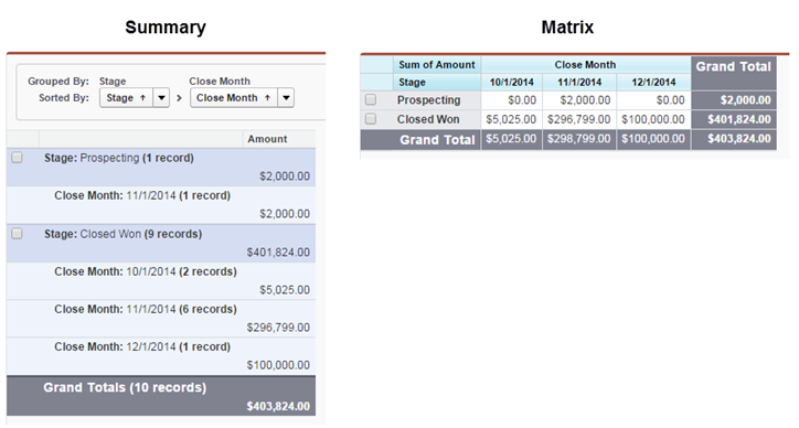
So why would you want to use a matrix report? If you’re looking for an at-a-glance overview of data, especially for something like totals of revenue or quantity of products sold, then the matrix report format is for you.
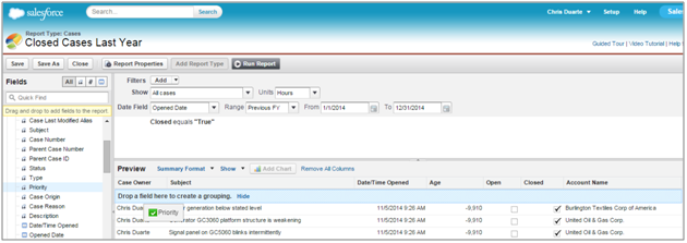
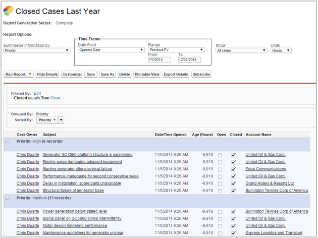
To illustrate the point, let’s look at two reports, side by side. The use case here is opportunities for last fiscal quarter, grouped by close month, with the amount summarized. Which report gives you an easier at-a-glance view of the same data?
Comparison of matrix and summary report
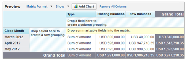
Now that you’re convinced, let’s build a matrix report. In this example, our CEO wants to know revenue trends, month over month.
Let’s start by creating the basic report. In this step, we’ll create a matrix report showing sales by type for each month.
  1. On the Reports tab, click New Report, choose the Opportunities report type, and click Create.
  2. Apply the following filters:
    1. Select All Opportunities for Show.
    2. Select Closed Won for Opportunity Status.
    3. Select Close Date for Date Field.
    4. Select Current FY for Range. Choose the range that best fits the data you want to analyze.
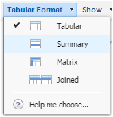
  3. Click Tabular Format and change the report format to Matrix.
    Report format selector
  4. Group the report by Type by dragging that field into the column grouping drop zone.
  5. Group the report by Close Month by dragging that field into the row grouping drop zone.
  6. Click the menu for the Amount column and select Summarize this Field.
  7. Select Sum and click Apply.
  8. Click Show and deselect Record Count, Details and Drop Zones to clean up the view.
  9. Click Save. The report preview should look something like this:
    Example of matrix report

Types of Reports - Summary Reports

Summary Reports

Summary reports are similar to tabular reports, but also allow users to group rows of data, view subtotals, and create charts. These will take you a bit more time to set up, but summary reports give us many more options for organizing the data, and are great for use in dashboards. Yes!
Summary reports are the workhorses of reporting—you'll find that most of your reports tend to be of this format.
Let’s get down to it and build a summary report. In this example, our Support Manager wants to do a post-mortem on Closed cases from the past fiscal year, grouped by Priority.
  1. On Reports, click New Report, choose the Cases report type, and click Create.
  2. Apply the following filters:
    1. Select All Cases for Show.
    2. Select Date Opened for Date Field.
    3. Select Previous FY for Range.
  3. Click Add to include an additional filter for cases where Status is Closed:
    1. Select Closed.
    2. Leave the operator set to Equals.
    3. Click the lookup icon and select True.
  4. The following columns should already be included in your report: Case Owner, Subject, Date/Time Opened, Age, Open, Closed, and Account Name.
  5. Select Tabular, and then select Summary.
    Report format selector
  6. Drag the Priority field from the Fields pane into the Preview pane, and drop it into the area labeled ‘Drop a field here to create a grouping’.
    Creating a summary report
  7. Click Save, name your report Closed Cases Last Year, and accept the auto-generated unique name.
  8. Enter a description and choose the My Personal Custom Reports folder.
  9. Click Run Report. The report should look something like this:
    Example of summary report

Types of Reports - Tabular Reports

Types of Reports:

There are Four Types of Reports:
1.Tabular Reports
2.Summary Reports
3.Matrix Reports
4.Join Reports

Tabular Reports:
Tabular reports are the simplest and fastest way to look at your data. Similar to a spreadsheet, they consist simply of an ordered set of fields in columns, with each matching record listed in a row. While easy to set up, they can't be used to create groups of data and there are limits to how you can use them in dashboards. Consequently, they're often best used for tasks like generating a mailing list.
Let’s make a tabular report! In this example, we’ll want to generate a list for our Account Executive of all open opportunities above a particular amount threshold, so that she can do some outreach this afternoon.
Sales use case: Review all open opportunities above a particular amount threshold.
  1. On Reports, click New Report, choose the Opportunities report type, and click Create.
  2. Apply the following filters:
    1. Select All Opportunities for Show.
    2. Select Open for Opportunity Status.
    3. Select Created Date for Date Field.
    4. Select Current FY for Range.
  3. The following columns should already be included in your report: Opportunity Name, Type, Lead Source, Amount, Expected Revenue, Close Date, Next Step, Stage, Probability (%), Fiscal Period, Age, Created Date, Opportunity Owner, Owner Role, Account Name.
  4. Click Save, name your report Open Opportunities This Year, and accept the auto-generated unique name.
  5. Enter a description and choose the My Personal Custom Reports folder.
  6. Click Run Report. The report should look something like this:
  7. Tabular report example